When I re-downloaded goodreads earlier last year as part of my “read more” resolution, I found a clunky and outdated relic of an app. It was confusing to navigate the numerous tabs, buttons, and icons — many leading to the same place. The homepage felt like a worse version of the app's discover page, rather than a place to see what my friends were reading. Posting about a book was only possible if you were rating and reviewing it. It was hard to find a compelling reason to keep the app other than the list-keeping capabilities.
Upon closer inspection, I discovered a number of engaging, but seemingly unkown features. You can make status updates, join interest-based discussion groups, and message friends. They weren't readily available, and despite these capabilities, I had yet to interact with another user since re-downloading the app. Finding features and engaging in the community turned out to be a buried and lonely experience.
But what if the app was a robust, community-centric platform for avid readers worldwide? Why not expand on the app's market share for more engagement, allowing users to bond over their favorite works, discover new books from like-minded users, and meet people who share the same love of reading?
Survey results from 24 Goodreads app users
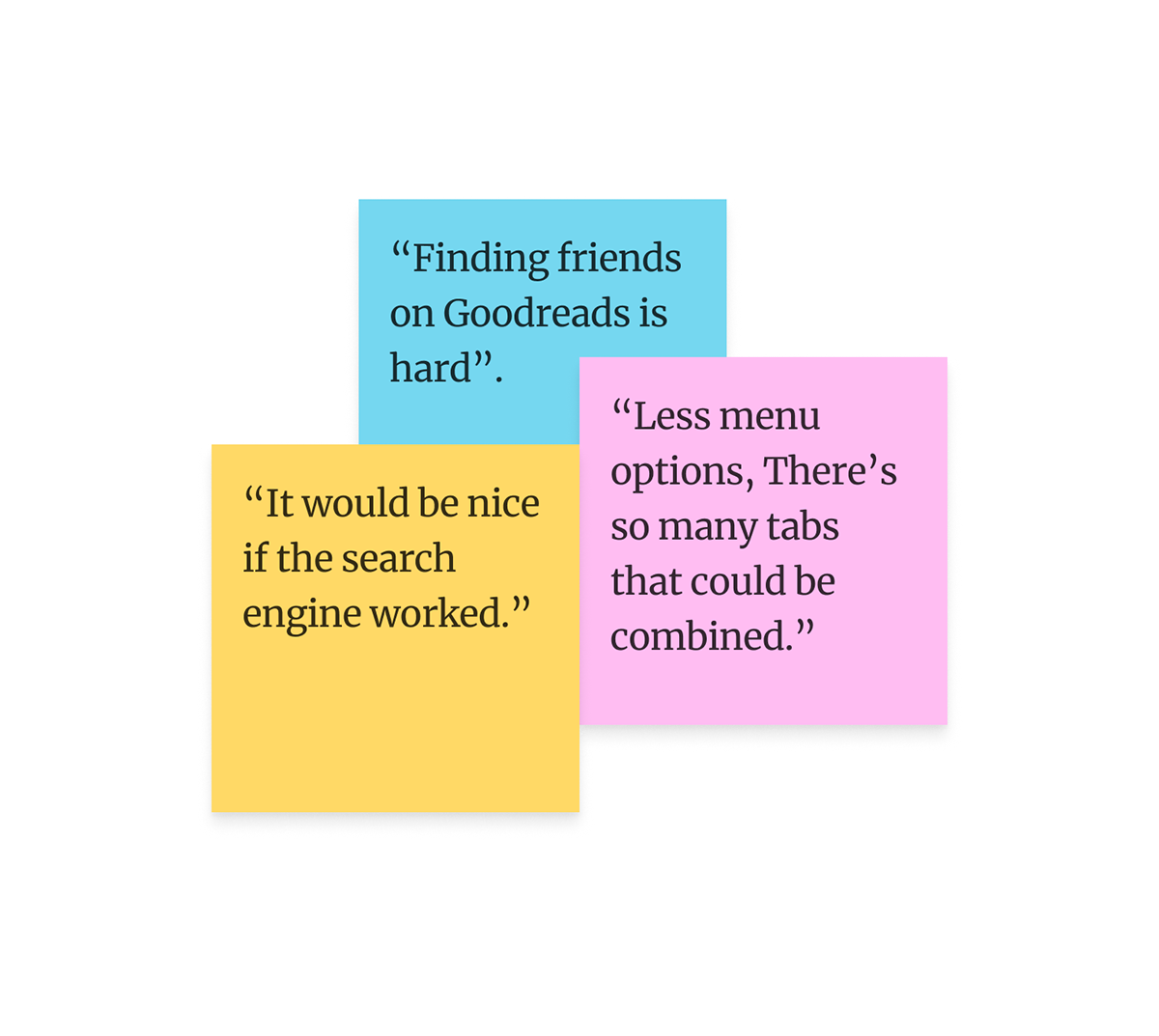
Only 16% of users utilize Goodreads’ social features.
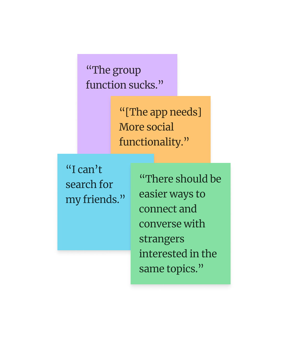
When asked what improvements they might make to the app, 36% of survey participants shared sentiments about improving or adding more social features.
Based on the results, either they wanted different social features OR they didn’t even realize there are already existing features for this. (I was inclined to believe the latter, considering that almost all of them are hidden when you open the app to the home page.
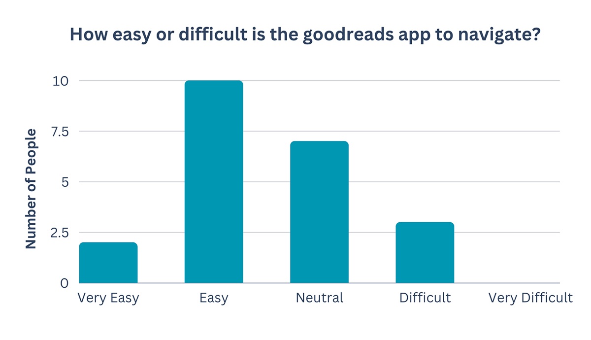
When asked about how easy it was to navigate the app, an overwhelming majority felt it was somewhat easy, or at the very least, a neutral experience.
However, when given the opportunity to suggest improvements, 43% of users cited that the app was difficult to navigate and contained many “hidden” features.
This lead me to believe that despite goodreads actually being difficult to use, many have used it for long enough that they've become used to the clunky nature of the app.
After hearing from users, part of me felt it would be wiser to start from scratch with a total overhaul. However, Goodreads is still the most popular of all reading community apps, and overhauling the app could have potential fallout with its dedicated customer base. Instead, I chose to focus on some impactful changes in features — an evolution of the product — to foster a stronger sense of community on the platform.
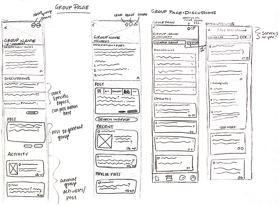
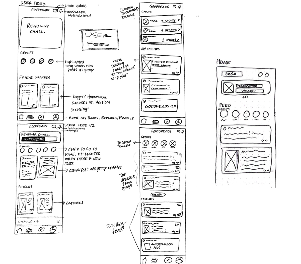
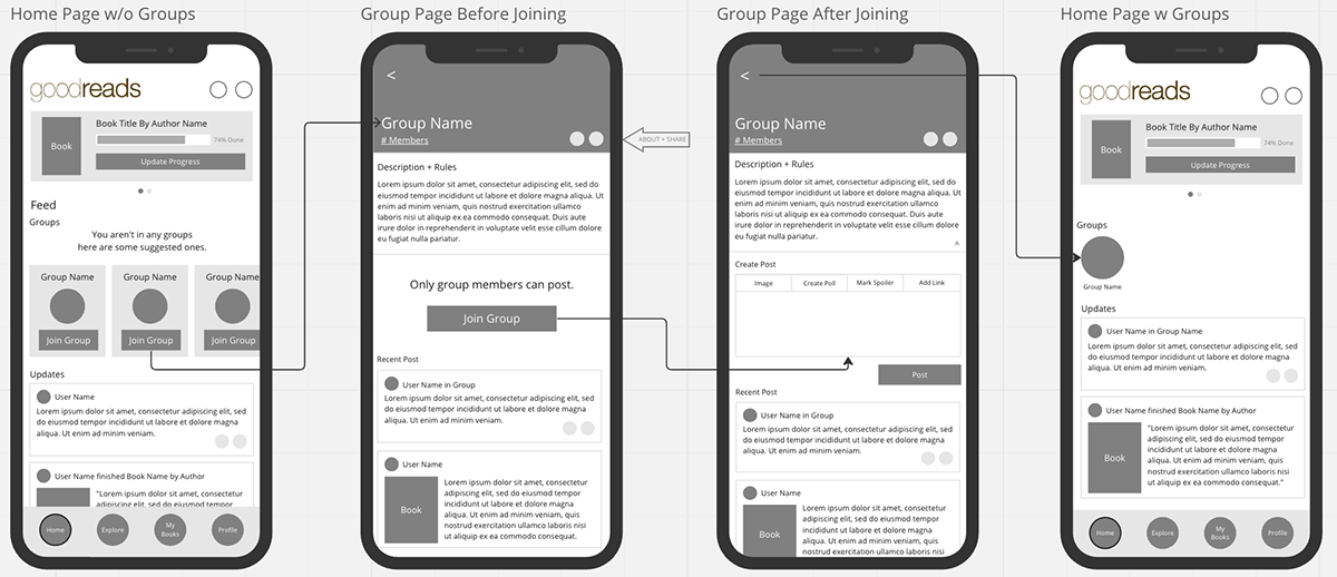
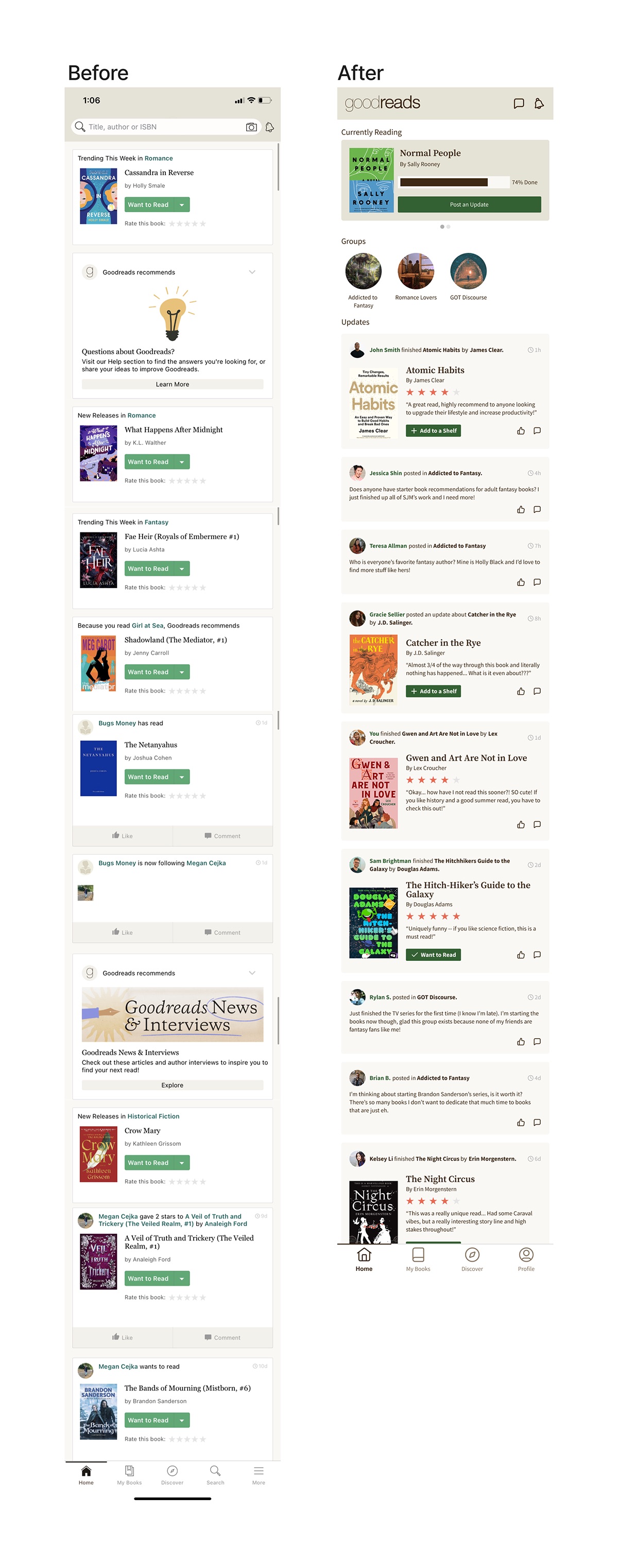
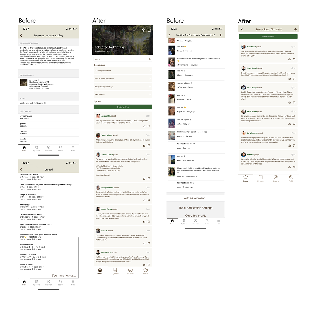
I knew I wanted the app to still feel familiar, but I also knew a few features would require a more thorough redesign. Specifically, posting to a group page and seeing other user updates there should be a much easier process. I took inspiration from popular text-based social media sites such as Reddit and Twitter, getting rid of the many steps it takes to create a post in a group. Instead, I wanted to allow the user to contribute in multiple ways: directly to the group as a whole, but also within discussion groups for more specific conversations that users can explore. A new and improved homepage would also include a banner of the user's own groups, leading the user within the app to participate in group features.
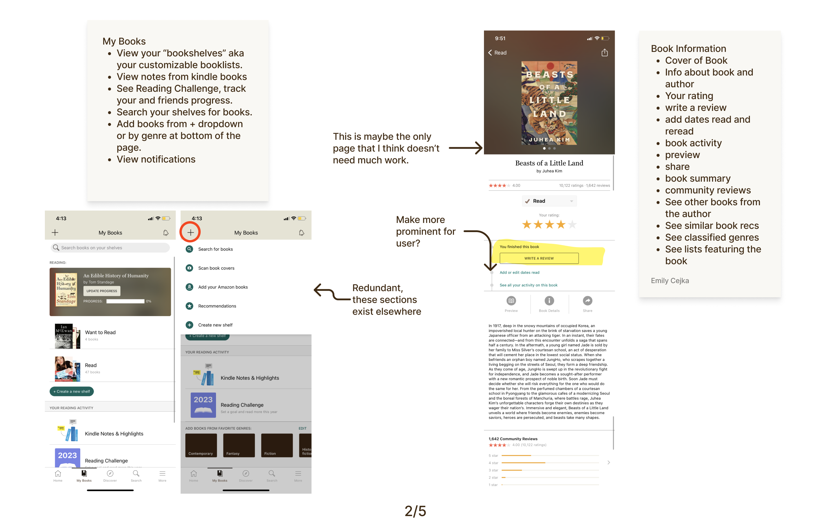
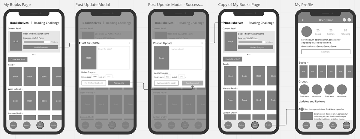
Previously, if you had thoughts or wanted to update your progress on your current read, it was a private feature that only you could view. However, the evolved version would encourage users to update their progress immediately after opening the app, creating a status update as opposed to a private note. You can update your progress and post your thoughts on your current read directly from the homepage.
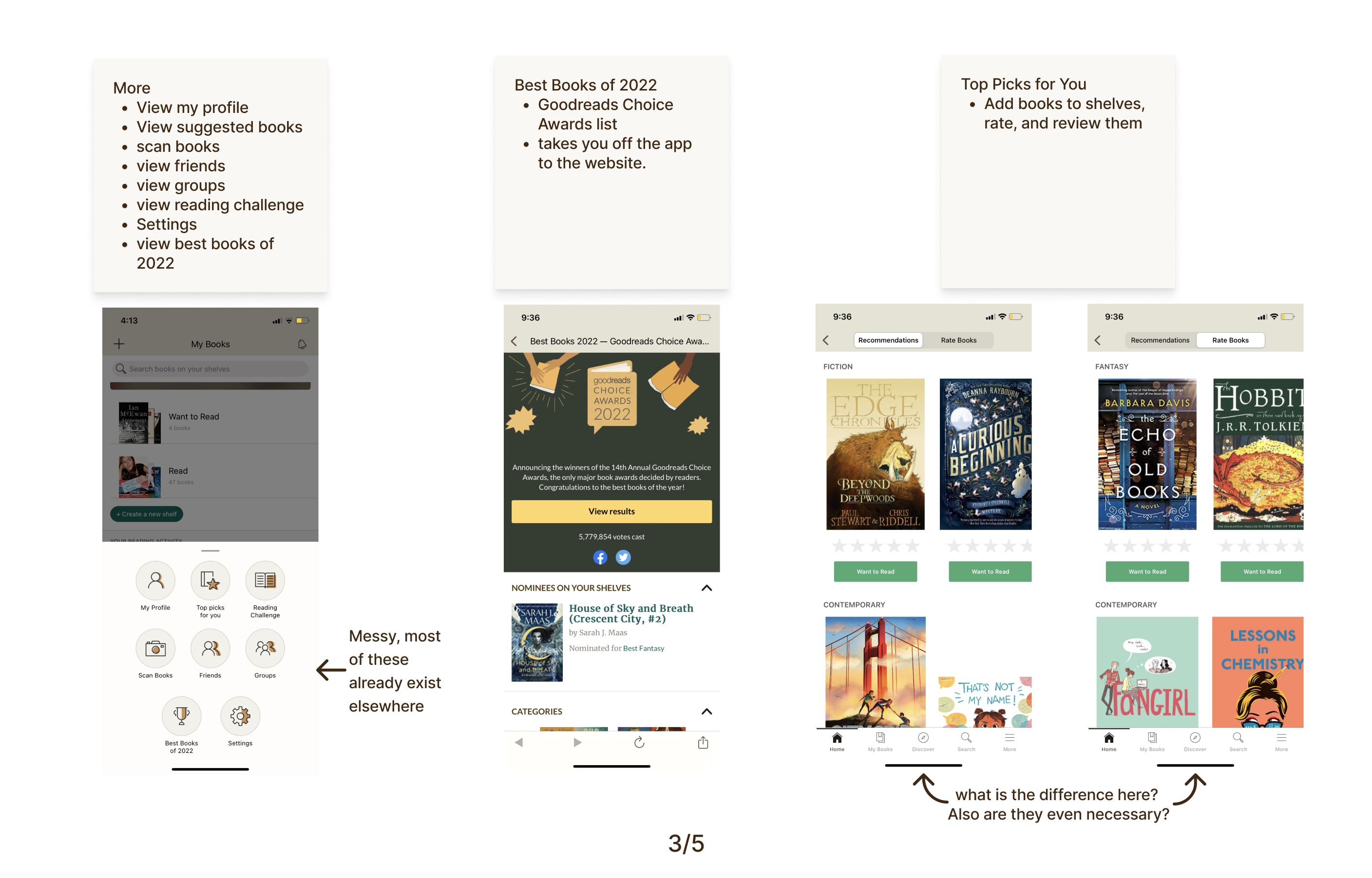
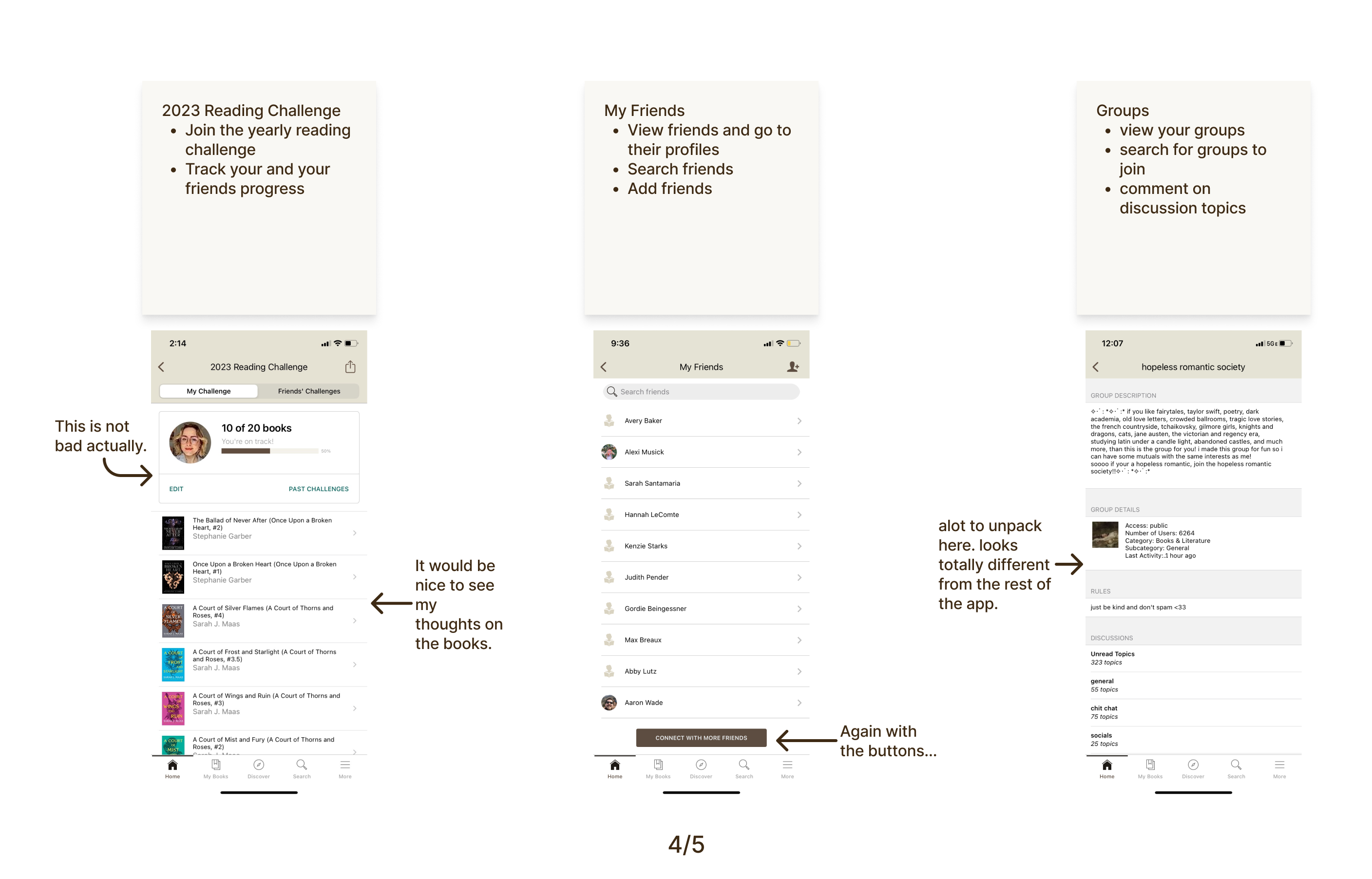
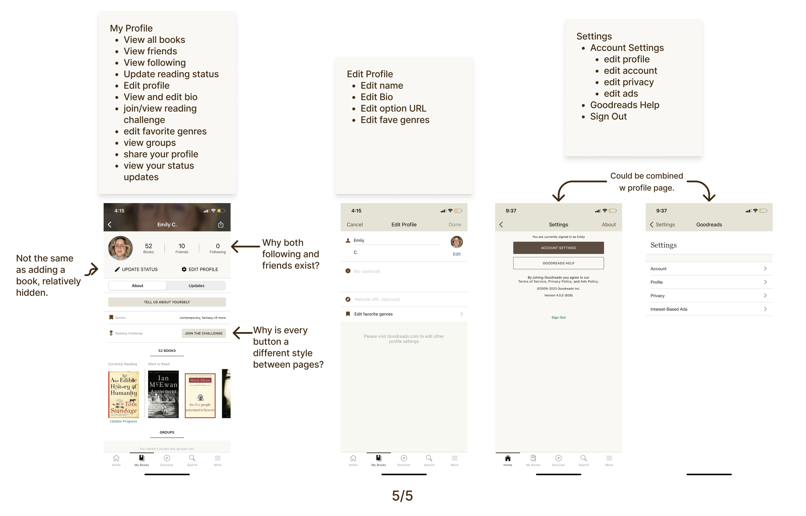
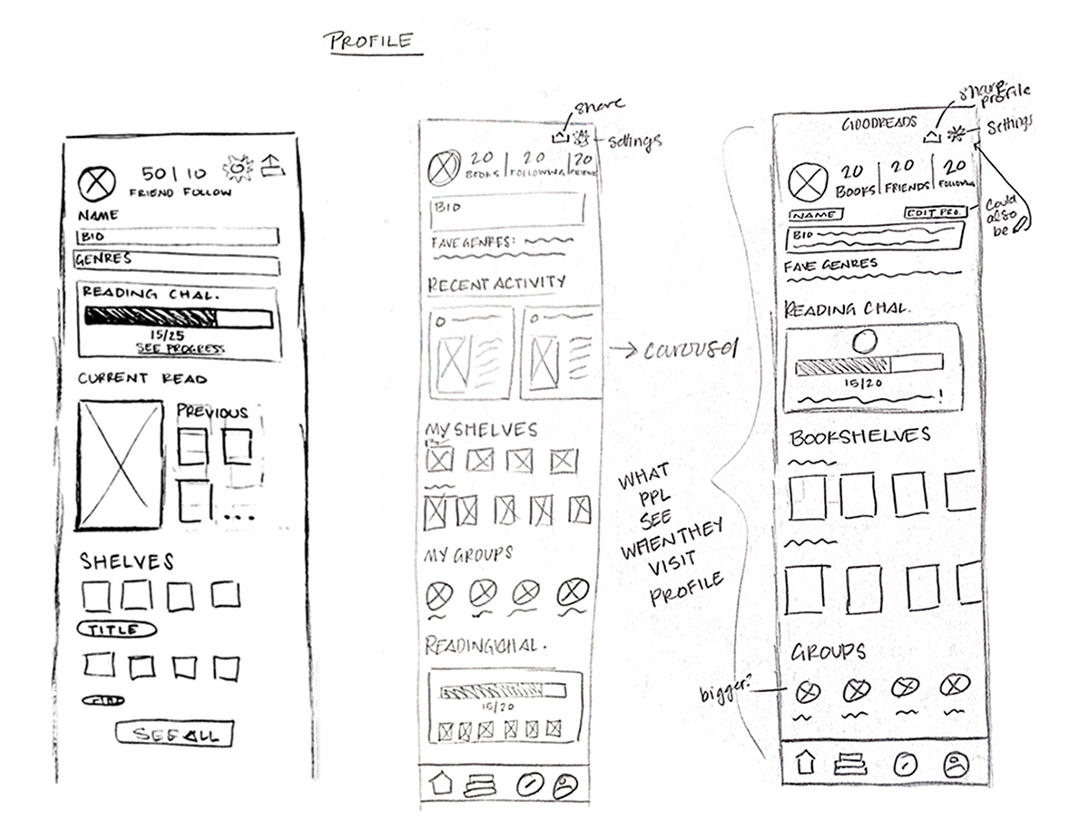
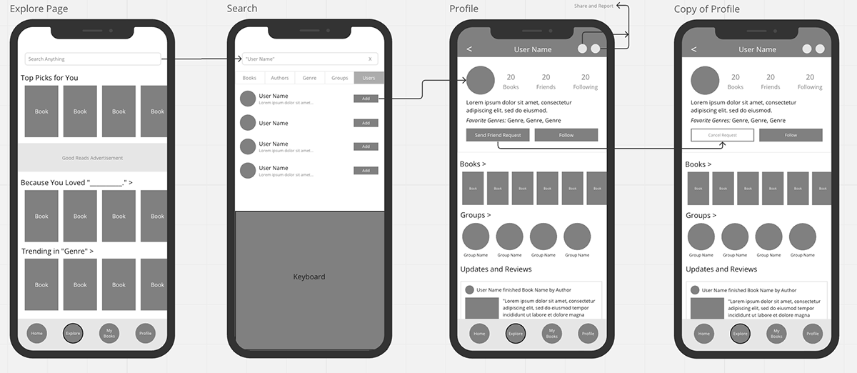
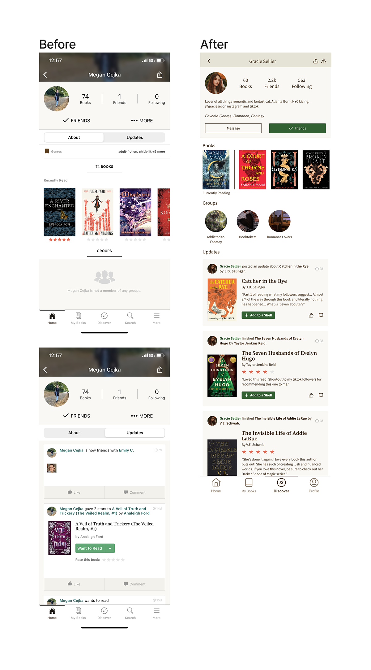
To also help guide the user and remove the paralysis of choice, it was easy to combine several screens and place them under the profile icon within the information architecture. Most of the icons were already in multiple places within the app and were adding to the clutter and confusion that users might have when attempting to achieve a goal.
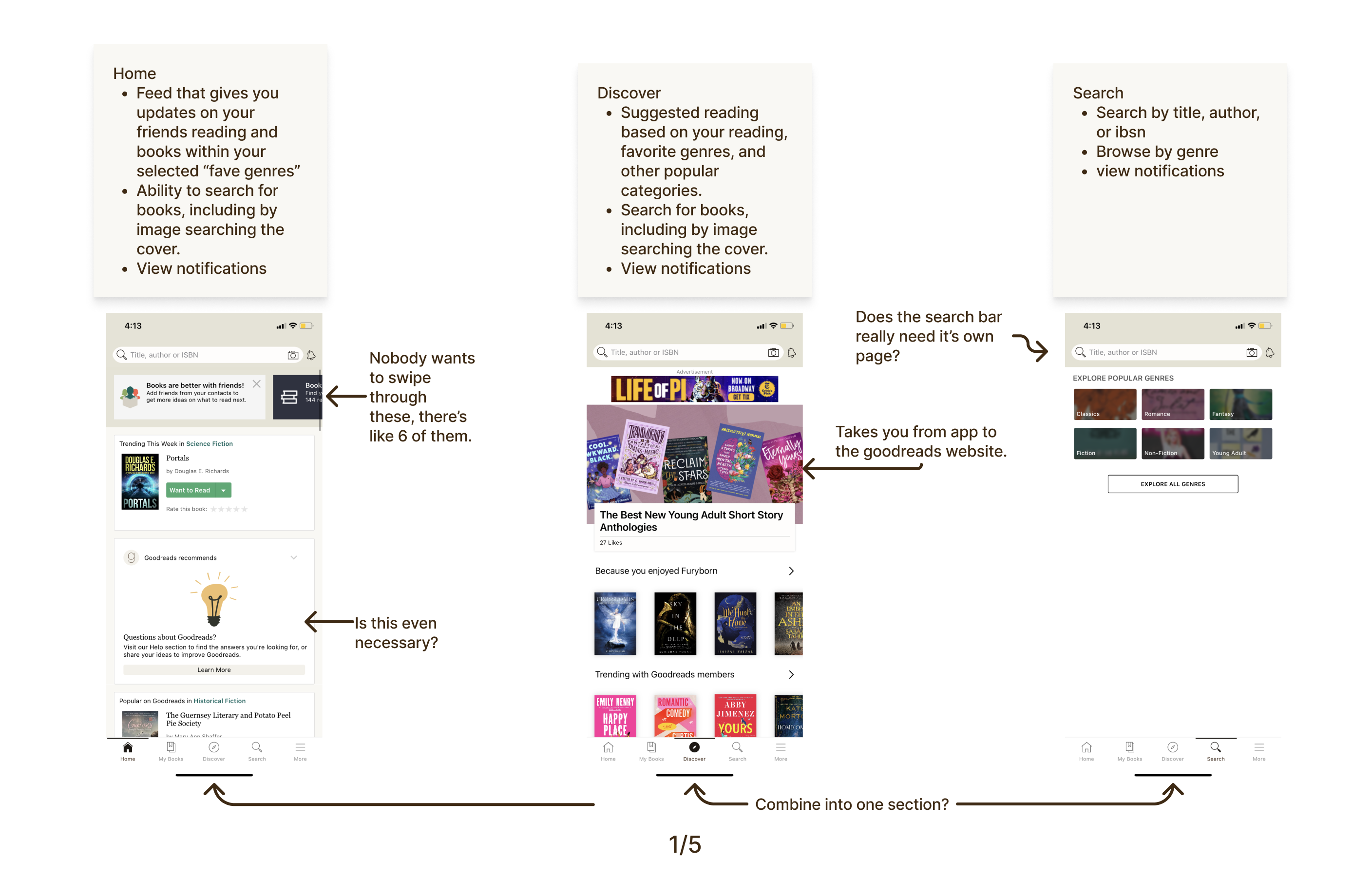
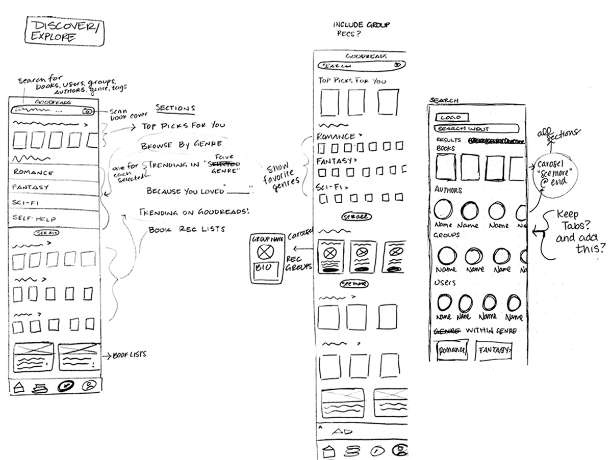
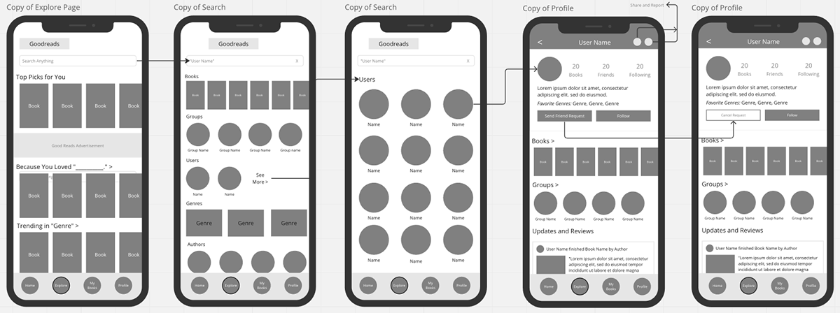
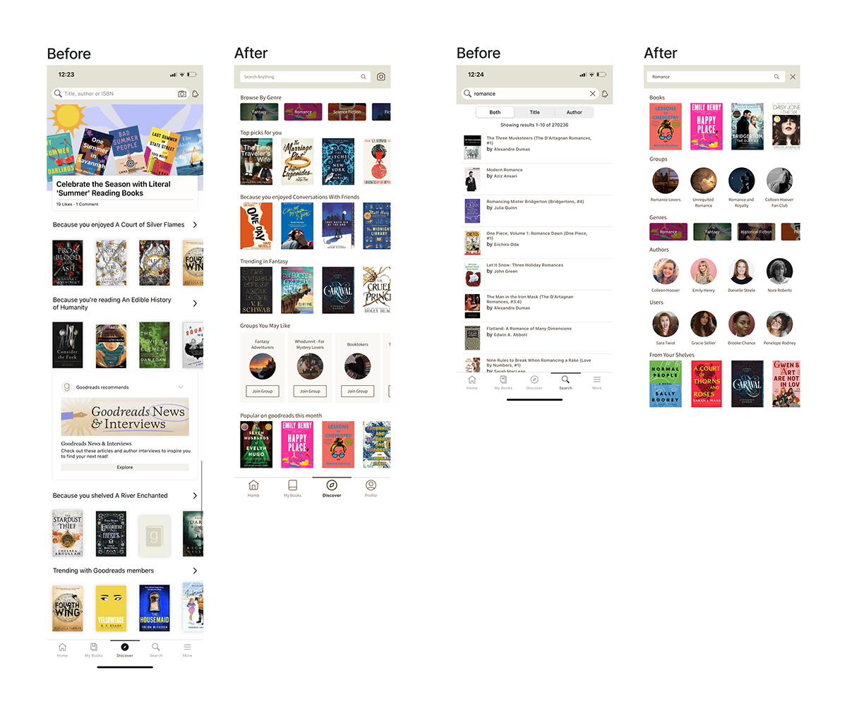
Having the search bar on almost every page, in addition to having a search icon in the navigation bar was overkill. Instead, the search bar is only on the discovery page. I played around with various layouts for the page to see what would be most effective in creating a more personalized and comprehensive experience.
In my early iterations, I considered adding a "stats" page inspired by Spotify's "wrapped" series and based on feedback from the survey, people wanted an easily digestible summary of their reading data. However, during the research phase, I recognized the need to prioritize streamlining existing features before discussing new ones.
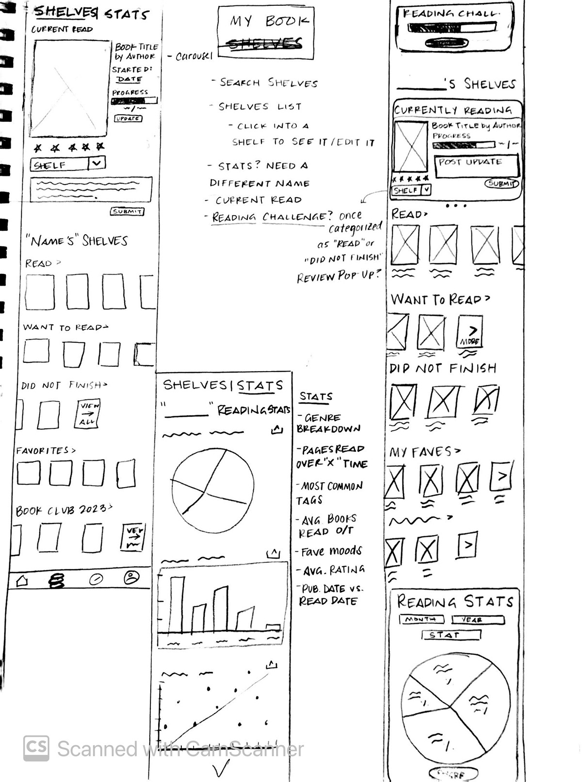
Once I had sketched out some options, I used Miro to create some low-fidelity mockups. In this phase, I was able to get a better idea of how each page would look and function as part of the user's journey through various tasks.
designing the search feature, I had originally come up with tabs that represented different result categories. But after looking through other apps that rely heavily on search capabilities, many of them first gave the user an overview of the top results, then allowed the user to filter the results (should they choose to). I took inspiration from Spotoify's desktop search results, too, to create search results that would allow the user to see the best matches at a glance.
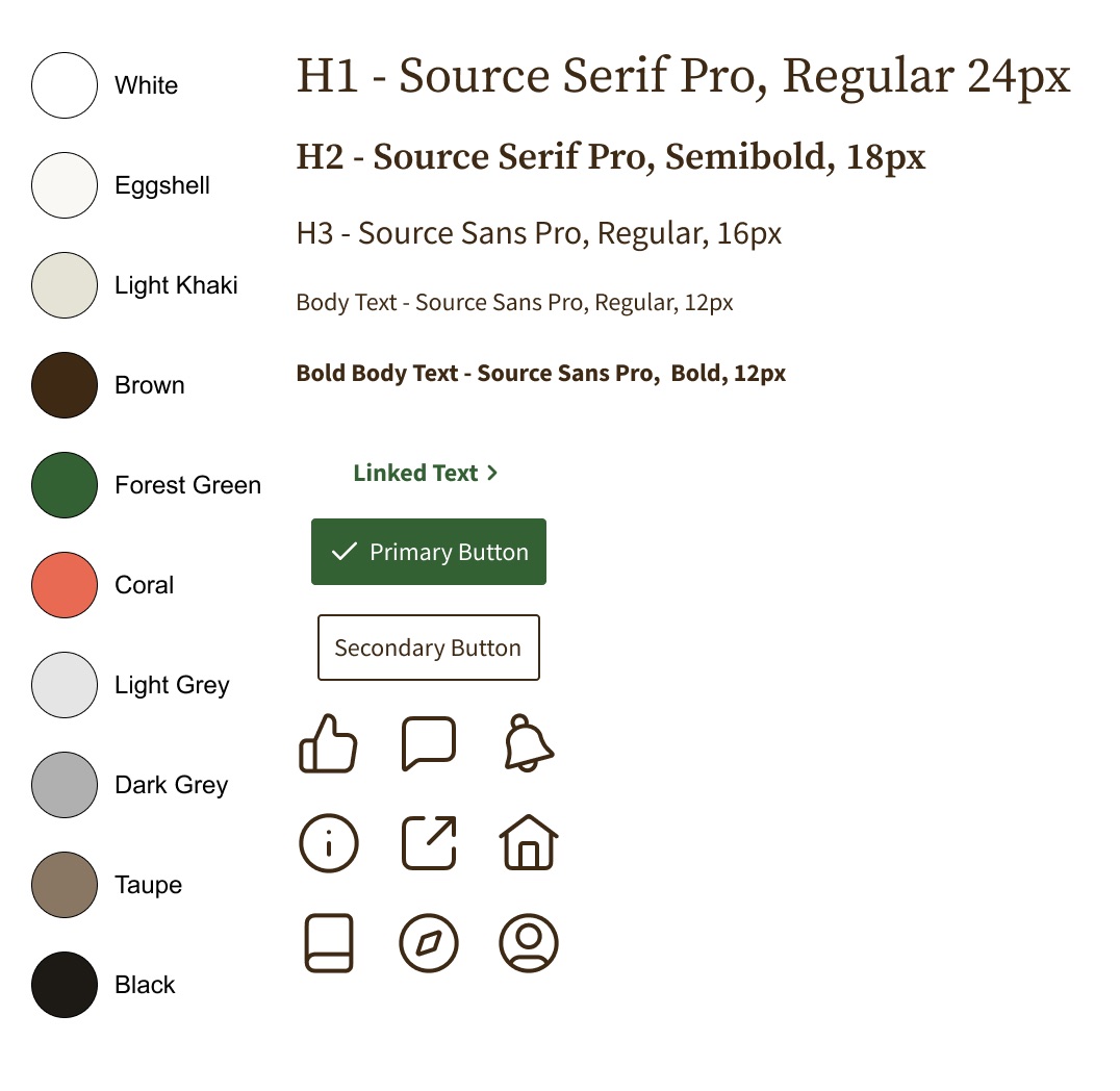
The feed got a new look, most notably making a text-based experience more visual. Small changes also push users towards more engagement with their peers, as well; for example, previously, when you saw books in the feed, the marked stars would be your own rating of the book rather than your friend's. Now, with the update, we can assert the homepage as a place to see updates from friends rather than as a secondary discover page.
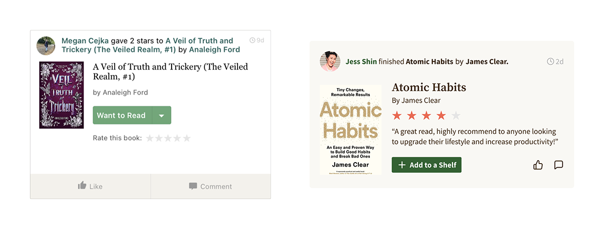
Instead of a feed filled with automated messages, the new design allows for a more personal experience where the user can easily engage with their friends in all aspects of their reading experience. Users are encouraged to update their profile as they go through a book rather than just marking it complete and throwing a rating on it. Groups are now easily accessible from the get-go and removing the search bar from this page allows the user to focus more on engaging with others.
Unfortunately, Groups had an entirely different look from the rest of the app. To unify the experience, I brought in patterns that are used across the rest of the app, getting rid of the bare-bones, second-rate approach given to Groups. Instead of only being able to post within a discussion, users can now easily post to the general group OR further refine their audience within a discussion group. The post button is easily accessible on the group page and when you join a discussion, and users can search keywords to find posts that better match their interests. You can also now share groups with your friends, making it easy to share your interests with people on the app and in your own life.
Combining the search and discovery page creates a central location for all book discovery tools, simplifying a user's journey to discover new books and allowing them to have more opportunities to take advantage of the many other features offered.
Instead of having headers and lists that take you to the goodreads website through an external link, the new discover page focuses on giving users quality recommendations based on their reading history and allowing them to explore genres, books, authors, and other users all in one place.
I simplified user Profiles by using a more consistent color scheme across all elements, bringing in patterns from the rest of the app. I got rid of unnecessary steps such as clicking through the "more" button to select another option and toggling between about and updates, opting for instead one feed for a user to easily scroll through.
While I only focused on a few changes to increase the app's usability, I know there is much more that could be done with the support of a larger team. Being able to collaborate with others who share your objective, while still focusing on the part you play within the group, would be invaluable when it comes to making thoughtful and user-centered design decisions.
This was also my first time formally conducting user research and I learned a lot about what to ask people, and more importantly, how to ask them. If I continued this project, I would love to take my research a step further and conduct usability testing to see how the changes I made are received by users.